


Bitwala set out to bridge two financial worlds - the trust-driven stability of traditional banking and the freedom and complexity of cryptocurrency. The challenge was to design a product that speaks both languages fluently: reassuring for fiat users, empowering for crypto natives.
As Product Designer, I led the UX design of Bitwala’s mobile app with a focus on eliminating transactional anxiety, simplifying currency management, and making hybrid finance feel intuitive, not intimidating. I collaborated closely with PMs, devs, and support teams to understand user pain points, integrate feedback loops, and balance regulatory requirements with real-time usability.
My approach prioritized clarity, emotional trust, and user autonomy - helping Bitwala evolve from a niche crypto tool into a more accessible, everyday financial platform.
Designing for Bitwala meant serving two user groups with fundamentally different expectations. Traditional finance users craved clarity, reliability, and predictable structure. Crypto enthusiasts, on the other hand, prioritized autonomy, speed, and granular control.
The core challenge. How do you craft a product that feels safe enough for newcomers to trust with their money - yet powerful enough for crypto natives to stay engaged?
We had to balance regulatory clarity with crypto’s dynamic nature, simplify complex financial actions, and eliminate the fear and friction often associated with hybrid transactions. Every decision had to walk the tightrope between reassurance and empowerment.
User Research. I partnered with product managers and support teams to analyze support tickets, app store feedback, and onboarding drop-offs. We also conducted moderated interviews with both fiat-first users and crypto power users to identify pain points in currency switching and transfer anxiety.
One key insight. Traditional users were more likely to abandon the flow when faced with fluctuating exchange rates or unclear confirmation steps - leading us to simplify and visualize conversions more transparently.
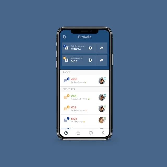
1. Designing for Trust. Ensuring security and clarity was my top priority. I redesigned transaction summaries to visually and semantically separate fiat and crypto values, enhancing user comprehension.
Use color coding (green = confirmed, red = canceled, amber = pending) to reduce ambiguity. I ensured key metadata - such as amount, fees, status, and date - was surfaced prominently for instant scannability.
2. Simplifying Currency Switching. One significant friction point was managing multiple currencies effectively. I designed an intuitive drop-down currency selector with country flags for faster visual recognition.
Ensured the user could preview exchange rates and fees in context before committing. Added subtle animations and confirmations to reduce anxiety around crypto conversions.
3. Reducing Transactional Anxiety. Money movement - especially with crypto - is inherently stressful. To alleviate this stress, I introduced inline status updates after transfers, such as 'Completed on 21st April' and 'Cancelled,' to visually reinforce the outcomes. Provided downloadable receipts in PDF for record-keeping and peace of mind. Used minimal visual noise to keep the user focused and informed, not distracted.
4. Balances & Activity: Visualizing Flow. Users craved not only to see their balances but also to understand the narrative behind those numbers. I crafted a dashboard card UI tailored for each account type - fiat and crypto - ensuring they remained unified in design while maintaining distinct identities. Applied iconography and contact avatars to help map transaction histories quickly. I implemented horizontal scrolling timelines to preserve clarity, even when presenting dense data.
5. Messaging & Human Layer. Incorporating direct messaging created a unique UX opportunity. This feature enabled users to seamlessly coordinate transfers with recipients directly within the app. Integrated user avatars and real-time confirmation icons for added trust. I ensured the chat UI remained clean and approachable, humanizing the often impersonal finance experience.
The redesign significantly boosted user confidence by providing clearer transaction summaries and more predictable interactions.
After refining the currency selection experience, we achieved a remarkable 28% reduction in drop-offs during the send flow.
User testers provided overwhelmingly positive feedback regarding the messaging features and the clarity of visual cues.
Reflection. Designing for hybrid finance isn’t about inventing new metaphors - it’s about knowing when to lean on familiar banking conventions, and when to gently evolve them. At Bitwala, I learned that building user trust is as much about what you don’t show as what you do: reducing clutter, surfacing only what matters in context, and providing consistent visual and emotional cues.
This project deepened my conviction that good UI is quiet, and that designing for financial products means designing for emotion - especially in moments of uncertainty. Clear flows, confirmations, and humanized interactions are what turn a transactional tool into a trusted companion.