


YouMe is a privacy-first social messaging app designed to restore control to the user. It empowers individuals to manage what they share, when, and with whom - redefining digital communication as intentional rather than impulsive.
I joined the founding team at the earliest stage, shaping the product from zero to MVP. As Lead Product Designer, I led everything from UX architecture and UI flows to branding and design systems. My focus was to design with restraint - crafting an experience that feels private, intimate, and emotionally intelligent in a saturated, noisy app landscape.
Impact at a Glance. 9/10 user satisfaction during usability testing for onboarding and messaging clarity.
Delivered full MVP: clickable prototype, design system, and investor-ready demo assets.
Designed a scalable architecture ready for voice, media, and group chat expansion.
User feedback highlights: “It feels like a quiet space,” “I’m in control of my messages”.
Informed by competitive mapping, persona workshops, and 3 rounds of user testing.
The Challenge. How do you build a messaging app that makes privacy feel effortless, not technical?
In an age of hyper-connectedness, YouMe’s goal was to give users space - to rethink what a message should feel like when you're not being watched, judged, or bombarded with noise.
The challenge was to design a product that felt: Secure, but simple. Private, but not isolated. Emotionally calming, yet feature-rich beneath the surface.
1. MVP with a Privacy-First Mindset.
Focused on core differentiators:
Granular chat-level privacy settings.
Timed messages and capture-blocking as defaults.
Swipe-based interactions with minimal UI footprint.
All decisions supported trust without overloading the user.
2. Designing for Trust and Ease.
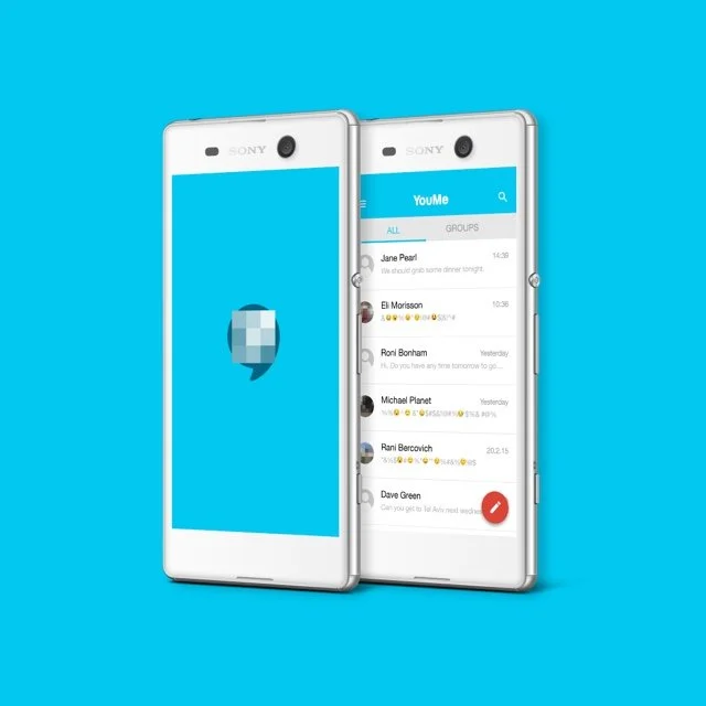
Home screen and chats emphasized white space, control, and flow.
Toolbars adapted dynamically based on context and intent.
Settings reframed not as features, but as boundaries the user controls.
3. Scalable UX Architecture.
Modular settings designed for future group chat and voice support.
Tabs for “People,” “Media,” and “Settings” created a lightweight navigation structure.
Iconography and interaction models kept intentionally quiet and non-invasive.
4. Visual and Brand Identity.
Built around subtlety, calm, and confidence.
Cyan/gray palette, rounded typography, and low-contrast shadows.
Microinteractions that gently reinforce decision-making (e.g. message expiration confirmation).
The overall look was intentionally quiet—focusing the user on their relationships, not the app itself. White space, minimal contrast, and unobtrusive transitions made the app feel like a sanctuary from social noise.
Outcomes
MVP completed and delivered on time for demo and investor showcase.
System ready for scaling to additional features (voice, media, groups).
Usability tests rated onboarding and core messaging at 90% satisfaction.
Users cited emotional benefits: “This app makes me want to take my time,”“I finally feel in control.”
Visual system and brand identity adopted for marketing decks and investor assets.
Reflection
YouMe was a lesson in designing less to create more. In an industry obsessed with features and engagement loops, we focused on quiet, intentional interaction. Every decision - from button placement to copy tone - was an exercise in restraint, clarity, and empathy.
More than just usability, we designed emotional safety into the product - and built a foundation for a more human digital conversation.