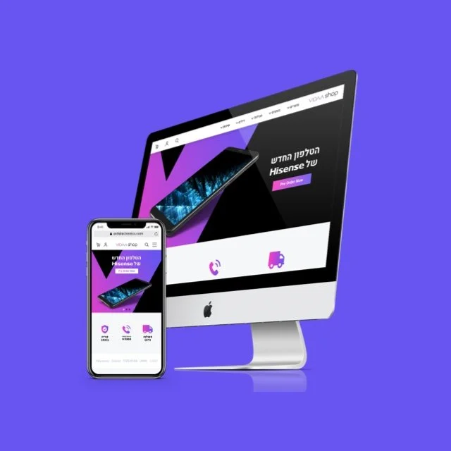
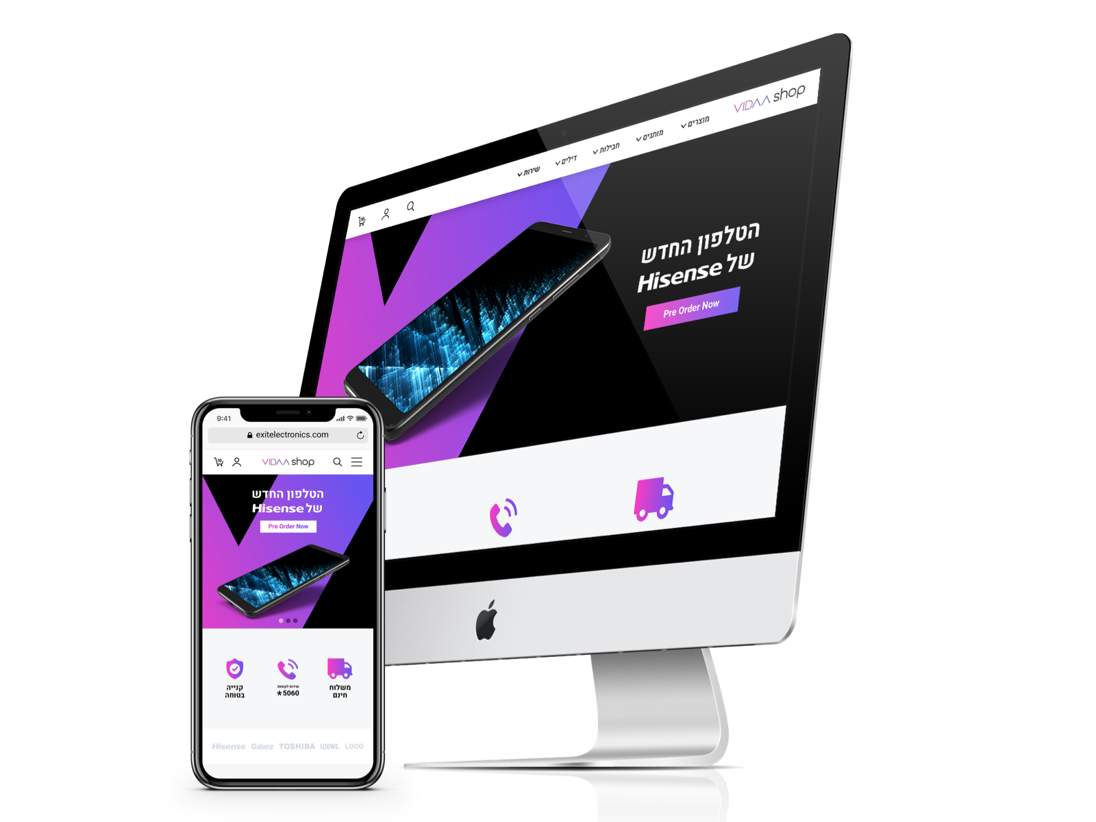


VIDAAShops is a digital storefront for consumer electronics and home appliances, targeting both local and international buyers. I was brought in to design a fully responsive e-commerce platform that didn’t just showcase high-volume inventory - it had to convert, scale, and reflect the energetic retail identity of the brand.
As Product Designer, I led the UX architecture, interface design, and system scalability planning - balancing clarity and emotion, product hierarchy and storytelling. The result was a mobile-first shopping experience that delivered intuitive exploration, clear checkout flows, and visual cohesion across hundreds of SKUs.
VIDAAShops had a massive inventory and a bold retail presence - but lacked a shopping experience to match. We had to ask:
How can we organize high-volume content without overwhelming the user?
How can we make the experience fluid for both mobile field shoppers and desktop decision-makers?
And how do we blend a modern, energetic brand aesthetic with e-commerce UI patterns users trust?
This was a UX design problem wrapped in a conversion challenge - all under real-world scaling constraints.
1. UX Architecture Focused on Flow
Simplified menu system using tiered navigation and smart categories.
Persistent cart preview across mobile + desktop for easier return navigation.
Checkout structured into 3 clean steps, always showing progress and price.
2. Visual System for Bold Commerce
Brand palette (purple-magenta gradients) used to guide flow and reinforce retail energy.
Modular product grid designed to flex for bundles, promotions, and filters.
Image-first layout with subtle motion to enhance product desirability.
3. Filtering That Keeps Context
Sidebar and drawer filters supported by sticky states + dynamic counts.
Added range sliders, tags, and checkboxes with scrollable content.
Designed filtering logic to support SKU depth without overloading mobile.
4. Checkout Built for Trust
RTL logic across Hebrew UI, LTR fallback for global view.
Autofill + smart defaults reduced friction for returning users.
Designed visual receipts, trust marks, and confirmation feedback for reassurance.
VIDAA’s look is dynamic and bold. The UI design combined clean white space, sharp typography, and high-contrast CTA buttons to maintain legibility and energy. Icons and micro-interactions added delight while reinforcing clarity.
Reflection. VIDAA wasn’t just an e-commerce redesign - it was a branding reset through UX. The real win wasn’t flashy visuals; it was clarity that converts, and structure that scales. Working on this project reinforced my belief that high-performance UX lives where systems thinking and brand energy intersect.
From a flooded product grid to a branded shopping experience - this was design that sold.