


Yous is a mobile-first insurance platform for scooter riders, designed to offer flexible, real-time coverage on a per-minute basis. The founding team approached me with a raw idea - no flows, branding, or technical framework - just a mission to make insurance simpler, faster, and more relevant to urban mobility.
As Product Designer and UX Strategist, I led the product from whiteboard to prototype, defining the user journey, shaping the real-time interaction model, and designing a visual system centered around trust, clarity, and control. I worked across design, product, and development teams to ensure that every screen - from onboarding to ride history - made insurance feel transparent, accessible, and human.
Impact at a Glance:
+35% increase in onboarding completion after redesign
+22% improvement in payment flow completion after UI simplification
Delivered fully annotated, developer-ready prototype and design system
User testing feedback: “It feels transparent,” “Finally, an insurance app I understand”
Informed by insights from user interviews, competitive mapping, and iterative testing
Designing for Yous meant addressing both unfamiliarity and skepticism. Users didn’t expect insurance to be “on-demand,” nor did they intuitively trust real-time tracking or pricing models they’d never encountered.
We faced core challenges:
How do you educate users about a pay-per-minute model in just a few screens?
How do you introduce real-time coverage in a way that feels empowering - not invasive?
How do you design for non-technical users without sacrificing product depth?
Our goal wasn’t just to design usability - it was to design trust at every tap.
1. Real-Time UX for a Real-Time Product. We needed to ensure that the core interaction of activating or pausing insurance was immediately intuitive for users. I crafted a streamlined control center layout featuring a bold timer UI, distinct toggle states, and accessible live ride history.
Bold “SHIELD ON” state created psychological assurance
Timer UI showed clear duration + estimated spend
Live ride history reinforced user ownership over past activity
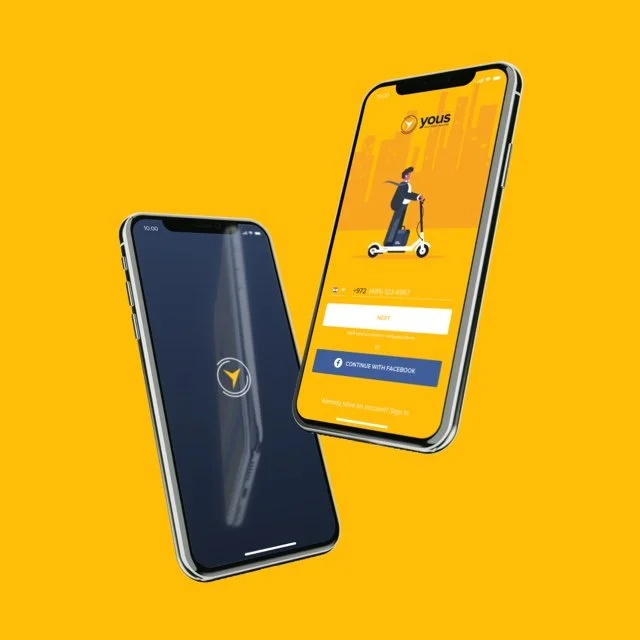
2. Onboarding That Educates, Not Overwhelms. Created a lightweight, 3-step flow combining illustrations and plain language.
Core benefits simplified: “1 Shekel/min. Instant cover. Cancel anytime.”
Added timed rewards (e.g. Amazon vouchers) to reinforce learning.
Tested multiple copy tones to find the right emotional balance.
User Research Insights. We conducted moderated interviews with 12 urban riders, split between first-time insurance users and digital skeptics. Two key themes emerged:
Users were confused by insurance jargon and skeptical of hidden costs.
A live coverage timer made sense only when paired with bold visual reassurance (e.g., “Shield On”).
These insights informed our copy tone, iconography, and the decision to include a persistent, color-coded status indicator throughout the session.
3. Seamless Setup and Payment. Simplified profile creation and credit card input.
Enabled scan-to-fill and minimal field design.
Terms/conditions screen redesigned with icon support and bold CTAs.
Optimized for “one thumb” usability in real-world conditions.
4. Navigation & Feedback.
Persistent summary footer with dynamic session stats.
Drawer menu reduced to 3 clear items: Payment / History / Settings.
Tooltips and microinteractions added without breaking flow.
Visual Design. The UI design utilized ample white space, bold typography, and optimistic iconography to foster a sense of control and user ease. Every screen was built for mobile-native use - thumb-friendly, readable at a glance, and responsive to real-world conditions.
Micro-interactions and UI feedback reinforced system status and user decisions without interrupting flow.
Team Collaboration. I worked closely with:
Founders to define product MVP scope and risk thresholds.
Developers to translate UX patterns into scalable logic under real-time constraints.
Marketing to align onboarding tone with brand messaging.
Customer Support to anticipate and prevent top friction points before launch.
Our agile approach allowed us to test, tweak, and ship an MVP on time, with full buy-in from all key stakeholders.
35% boost in onboarding completion.
22% increase in successful payment flow completions.
Delivered full prototype + annotated design system, ready for sprint cycles.
User testing confirmed improvements in trust, usability, and comprehension.
Post-launch feedback showed lower support requests for ride/session management.
Reflection. Yous wasn’t just a design project - it was a trust-building mission. We weren’t selling a feature; we were shifting a mindset. I learned that in insurance, design clarity is inseparable from emotional clarity. When users understand what’s happening and feel in control, they’re more likely to engage - and more likely to stay.
From onboarding to micro-interactions, every detail had to reinforce a single message: You’re covered, and you’re in control. That was the emotional core of the product - and the compass that guided my decisions.