


Jaiota is an innovative smart-locking and freight-tracking system designed to bring transparency and control to global container shipping. I was brought in to design a responsive e-commerce platform that would communicate complex industrial technology to a risk-averse logistics audience - while also driving B2B sales across desktop and mobile.
As Product Designer, I led the end-to-end UX and UI design of the site, translating technical features into a clear, confident experience. My goal was to balance industrial credibility with intuitive usability - designing for both enterprise decision-makers and field operators using the platform in rugged environments.
Impact at a Glance:
+30% increase in conversion rate post-launch.
Reduced bounce rate by 24% through clearer product storytelling.
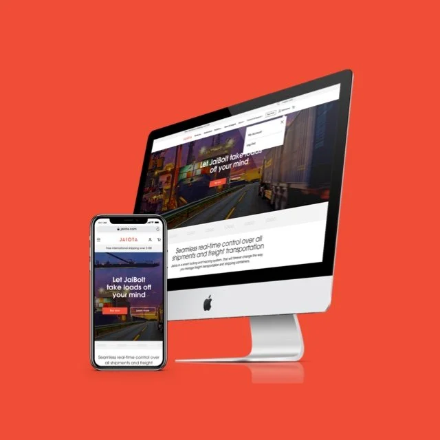
Delivered fully responsive site optimized for field + office workflows.
Informed by 5 stakeholder interviews and 2 rounds of usability testing.
Created scalable design system + custom iconography for dev handoff.
Jaiota’s technology was cutting-edge - but the logistics industry it served was conservative, risk-averse, and slow to adopt digital platforms. The design challenge was twofold:
Simplify and demystify technical product features (like geo-fencing, real-time monitoring) for a non-technical audience.
Build immediate visual trust to increase conversion, while optimizing for both field operability and executive-level decision-making.
We also had to ensure that users could navigate the store efficiently - whether they were buying from a warehouse floor or a corporate laptop.
User Personas. We interviewed field operators, logistics managers, and supply chain executives to understand their pain points. Key findings:
Field users prioritized quick access, large tap targets, and minimal loading.
Buyers were drawn to clear ROI and feature transparency.
Industry-wide distrust of overly “flashy” tech design led us to favor structured layouts, clear iconography, and data-focused visual language.
Iterative Feedback Process. We ran two rounds of usability testing with simulated buyers and technicians. Early feedback showed confusion around feature hierarchy and unclear CTA labeling. We responded by:
Reorganizing product modules for scannability.
Increasing visual hierarchy of CTA buttons.
Simplifying cart interactions, especially on mobile.
Later testing showed faster time-to-checkout and greater trust in product descriptions.
From Industrial Tech to Trustworthy UX.
1. Designing for Clarity + Conversion.
Created a responsive layout optimized for both touch and desktop.
Built with mobile-first logic, targeting field users on-the-go.
Established clear typographic hierarchy and strong grid for scannability.
Designed CTA zones that adapt based on screen size and scroll behavior.
2. Telling a Simpler Story.
Developed a modular storytelling system using visual cards and icons.
“How It Works” section used step-by-step visuals to onboard users quickly.
Key value props (e.g. role-based access, real-time tracking) highlighted with clear affordances.
Designed transitions that lead naturally from info → decision → purchase.
3. E-commerce Flow Optimization.
Streamlined checkout with real-time total updates and editable quantities.
Introduced a mobile cart drawer to support quick interactions.
Used clear error states and confirmations to reinforce trust in each step.
4. Building a Cohesive Brand System.
Applied Jaiota’s blue/red/gray palette for industrial authority.
Designed a custom icon set for logistics-specific concepts (e.g. lock status, fleet roles).
Developed hover and selection states to guide interaction subtly.
Used white backgrounds and clean layouts to elevate content clarity.
Visual Identity: Our design embodies precision and control, reflecting Jaiota's commitment to excellence. Utilized clean white backgrounds, structured layouts, and bold headers to instill confidence in users. Incorporated subtle animations and modular content blocks to maintain user engagement without causing overwhelm.
30% increase in product-page-to-cart conversion.
24% drop in bounce rate on key landing pages.
Full cross-device optimization improved field operability.
Final deliverables included a fully scalable design system + asset kit for dev handoff.
Stakeholders reported increased client trust in Jaiota’s digital presence post-launch.
Reflection. B2B digital experiences often lag behind their consumer counterparts - but that gap represents a huge opportunity. With Jaiota, the goal wasn’t to make logistics “sexy” - it was to make it feel trustworthy, accessible, and strategically modern.
This project reinforced my belief that even complex products can be simplified through clear structure, familiar interaction patterns, and storytelling that respects the user’s mindset - whether they’re buying from a laptop or from the loading dock.