


The redesign transforms Mediton from a dated clinical identity to a contemporary healthcare brand ready to scale, integrate with Shahal’s tech-first approach, and remain relevant in a competitive B2B health landscape.
Mediton is a national provider of occupational and preventive healthcare services for organizations and enterprises.
Challenge. Mediton’s old brand felt outdated and generic - far from the cutting-edge, mobile-first medical services they offer. With a partial acquisition by Shahal Group, it was time for a bold visual shift.
Solution. I created a modern, clean visual identity rooted in clarity, care, and innovation.
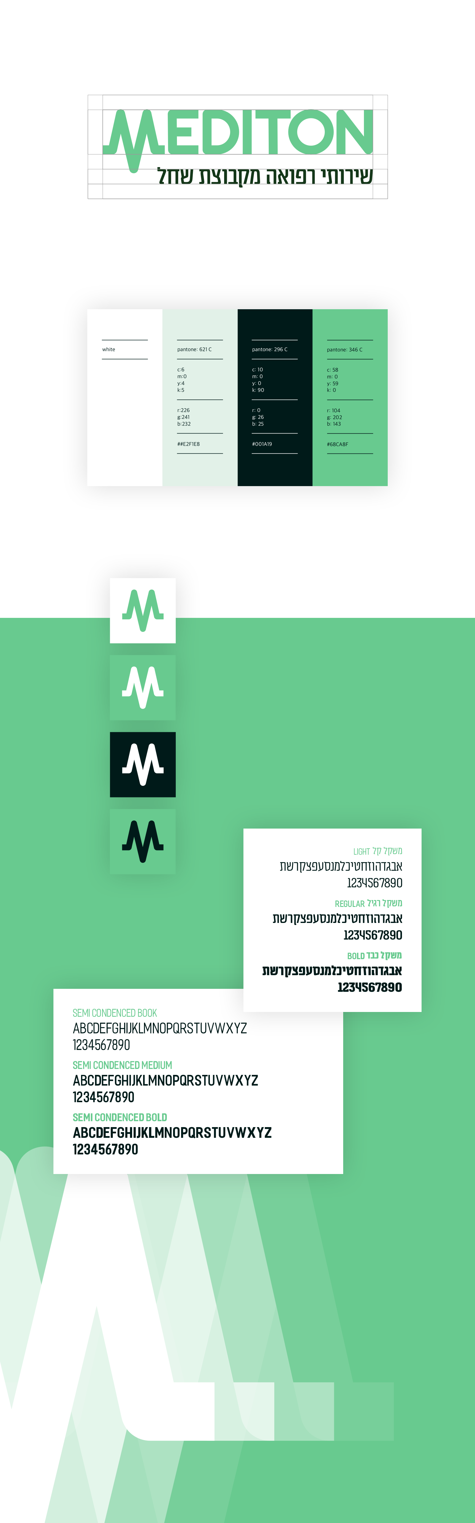
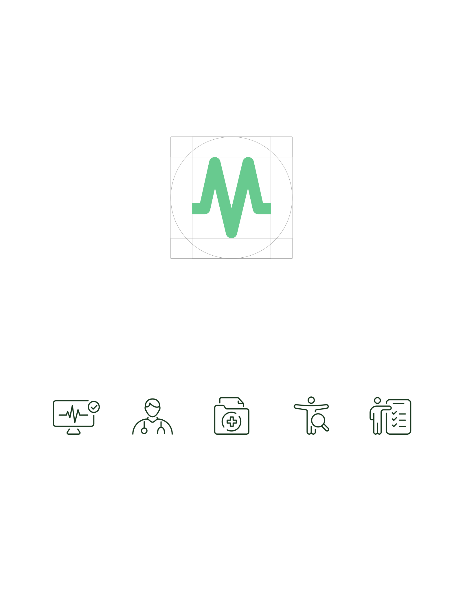
The new logo introducing a dynamic, forward-facing "M" waveform - symbolizing life, health monitoring, and continuity. The typeface is geometric, solid, and approachable, reinforcing the brand’s position between clinical precision and personal care.
Color palette:
Mint Green: Represents freshness, care, and vitality
Deep Teal: Evokes trust, professionalism, and depth
White & Black: Used for clarity and contrast across interfaces.
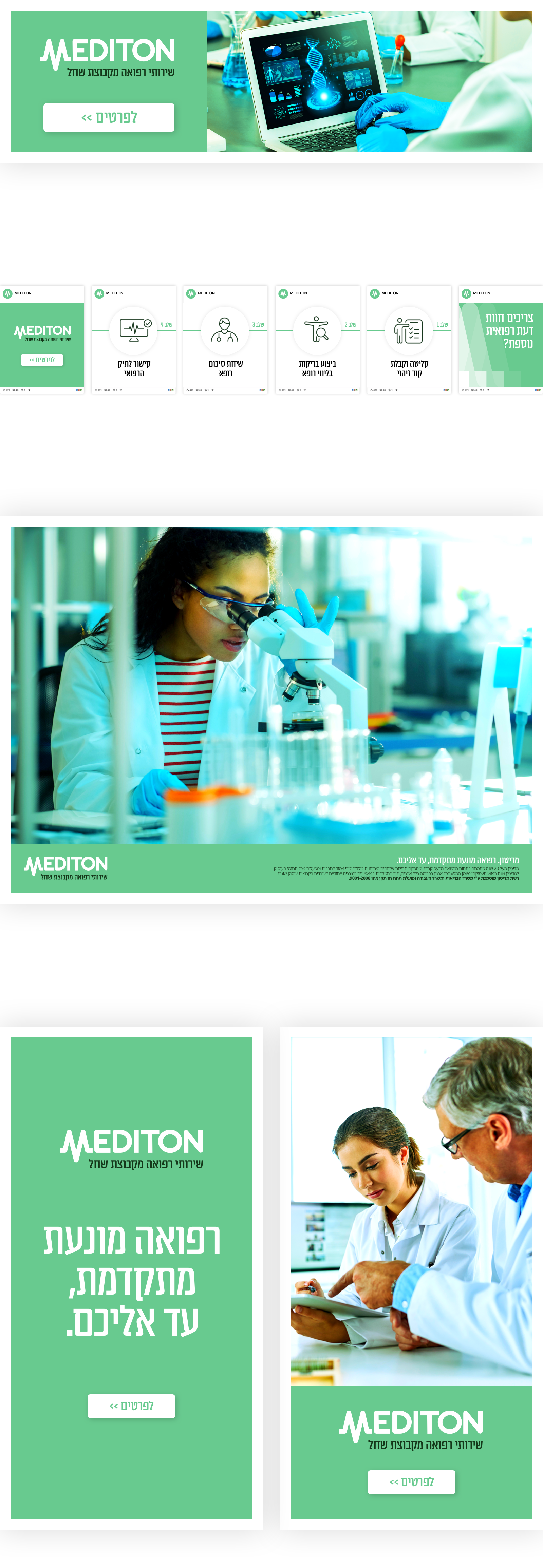
Modular layouts, custom icons, and structured typography to unify all brand touchpoints.
The rebrand positioned Mediton as a premium, technology-forward medical service provider for enterprise clients. The new identity resonates with both current and prospective partners, helping the brand stand out in a traditionally conservative sector - without losing its core DNA of trust, reliability, and care.
The result is a flexible, future-proof system applied across print, digital, mobile units, and social - turning Mediton into a standout name in B2B healthcare.
Impact. A complete transformation from clinical and corporate to confident, modern, professional, scalable, and ready for growth.